
Back before we were sheltering-in-place, we hired a window tradesman. He met us at the house, looked at each window, and we discussed the project. We want to keep all the current windows, but they need some attention. Some open and close easily, but many do not. And all of them need to be painted inside and out (after the loose old paint is taken off).
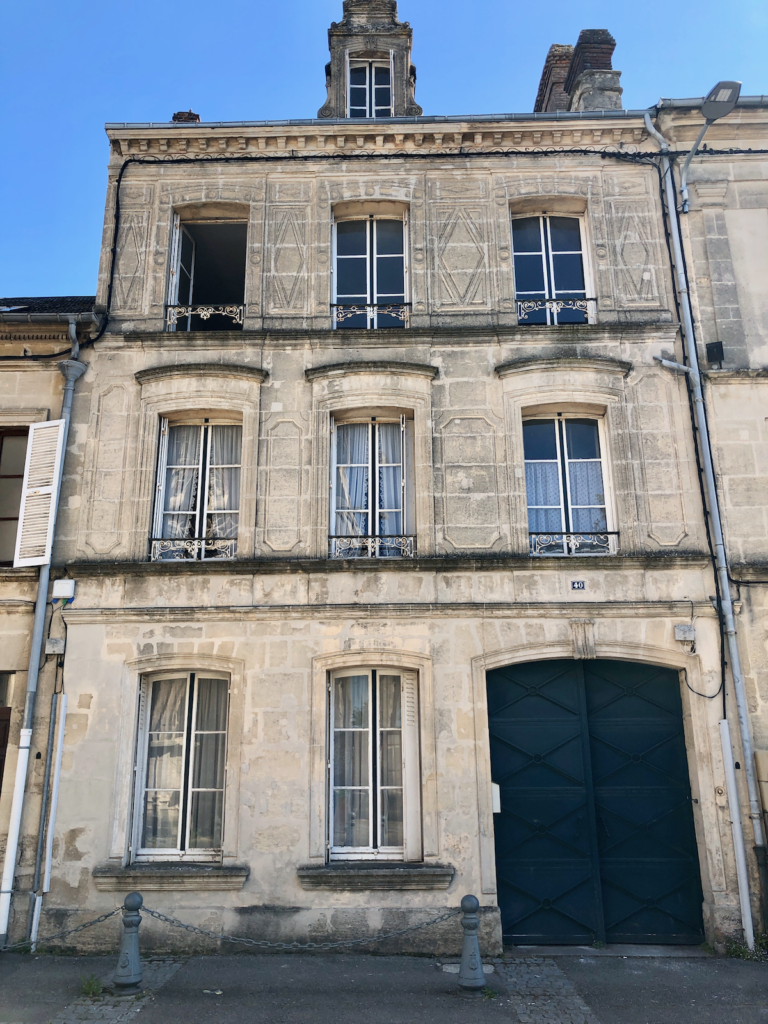
There are 9 windows at the front of the house, and 7 windows at the back of the house, and we hired him to get all 16 in good working order. We especially love the windows at the front of the house — the wood at the top has a gentle arch to custom-fit the arched stonework, and they are quite lovely.
We also hired him to repair/restore the shutters. Shutters in France are pretty much universal. Every window in every building in every city and town has shutters. That might seem like a big exaggeration, but it’s really not. Opening and shutting the shutters each day is a part of the culture.
When we lived here before I totally embraced the shutters, and I would go from bedroom to bedroom in the morning, opening shutters and making beds. But this time around, I haven’t made a habit of it — I’m not sure why.
Anyway, at the front of the house, the shutters are metal and they fold into themselves and sort of disappear when they are open. They are white, but the paint is badly peeling and they look pretty sad. Luckily they still work well and just need to be freshened up. So the window tradesmen will take them down, have them sand-blasted, then painted or powder-coated, then re-installed. The back of the house has wooden shutters. They’ll be painted too.
The last we heard, the window and shutter work could begin as early as the next two weeks (I really hope this is true!), so I really need to settle on an exterior paint color that will be used on the shutters, windows, and the front door.
Here are some doors around town so you can get an idea of the range of colors we see:
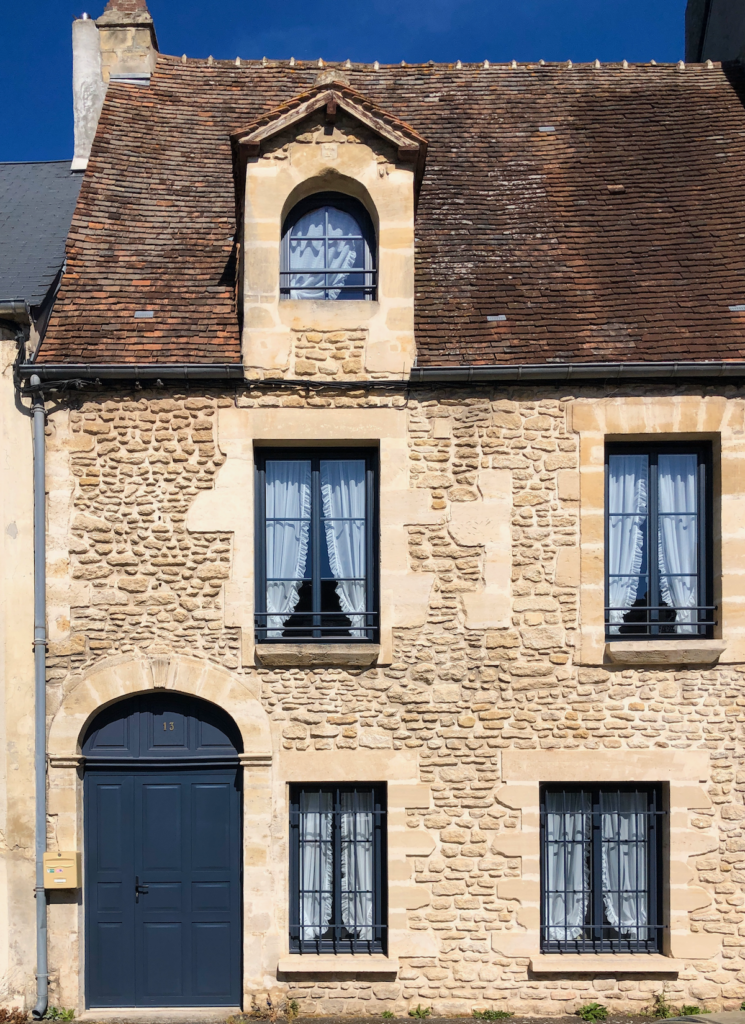
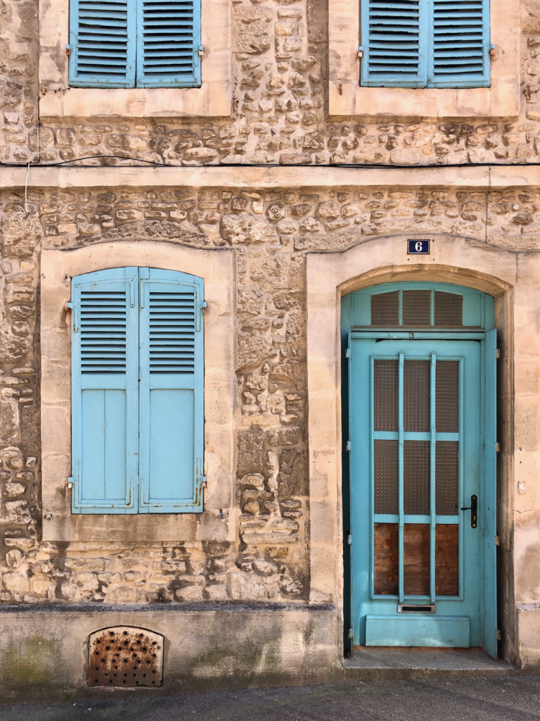
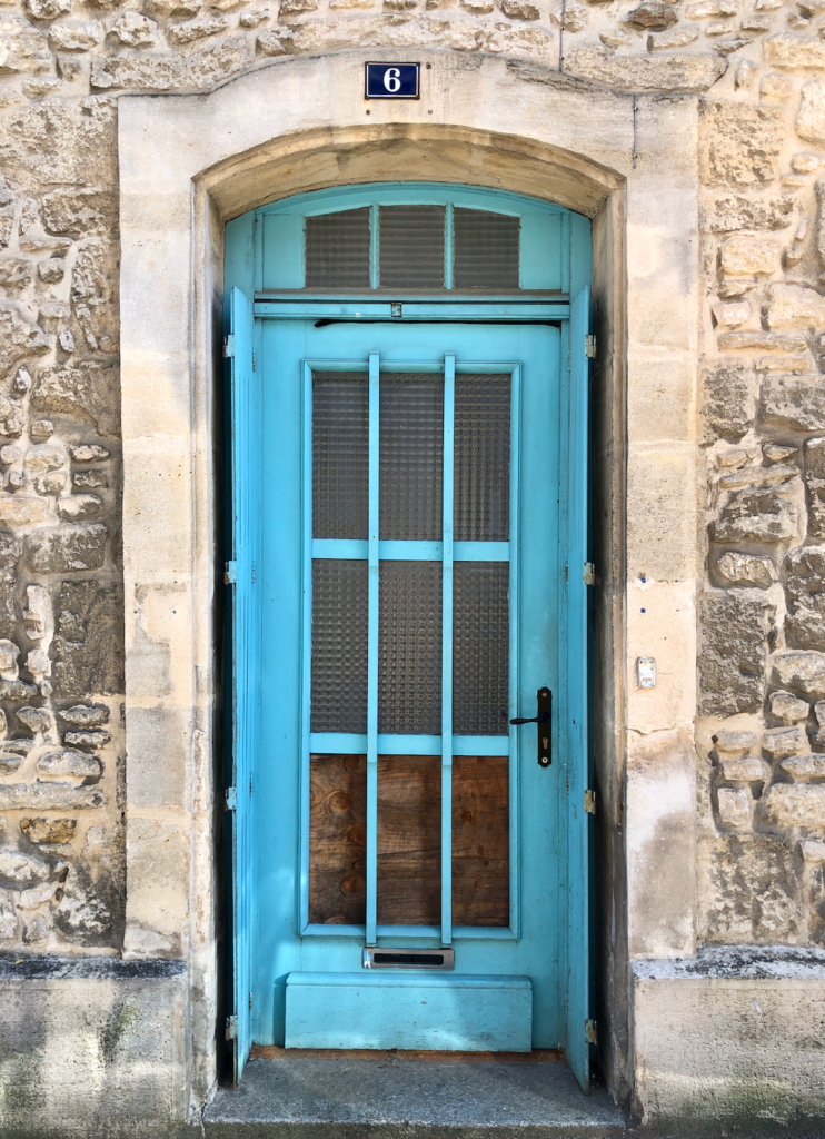
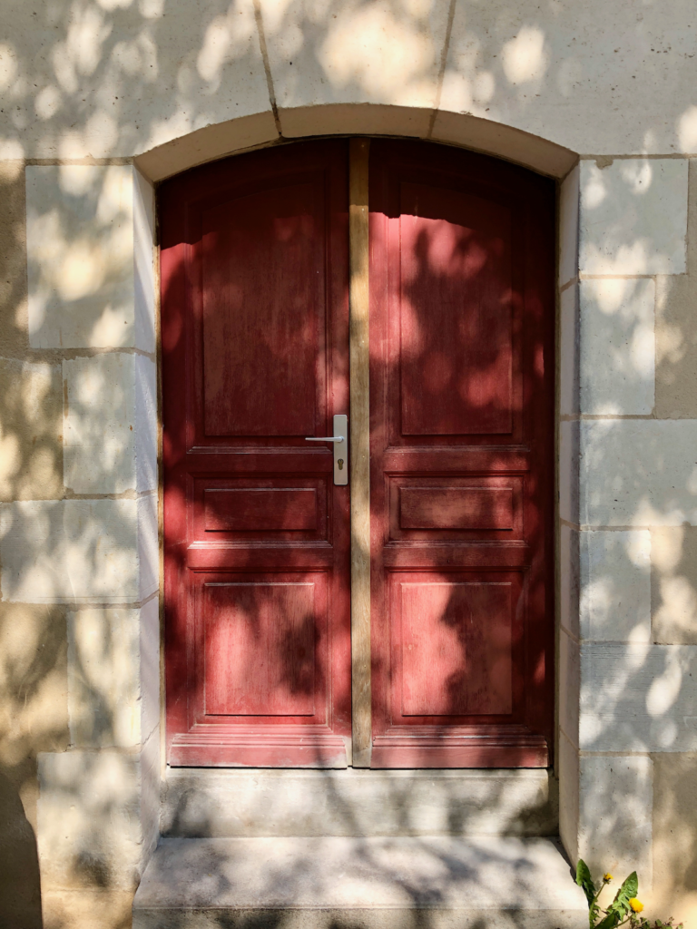
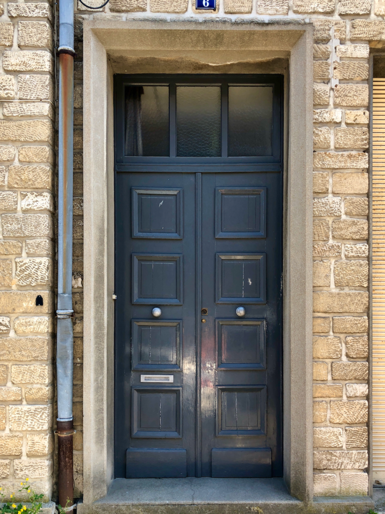
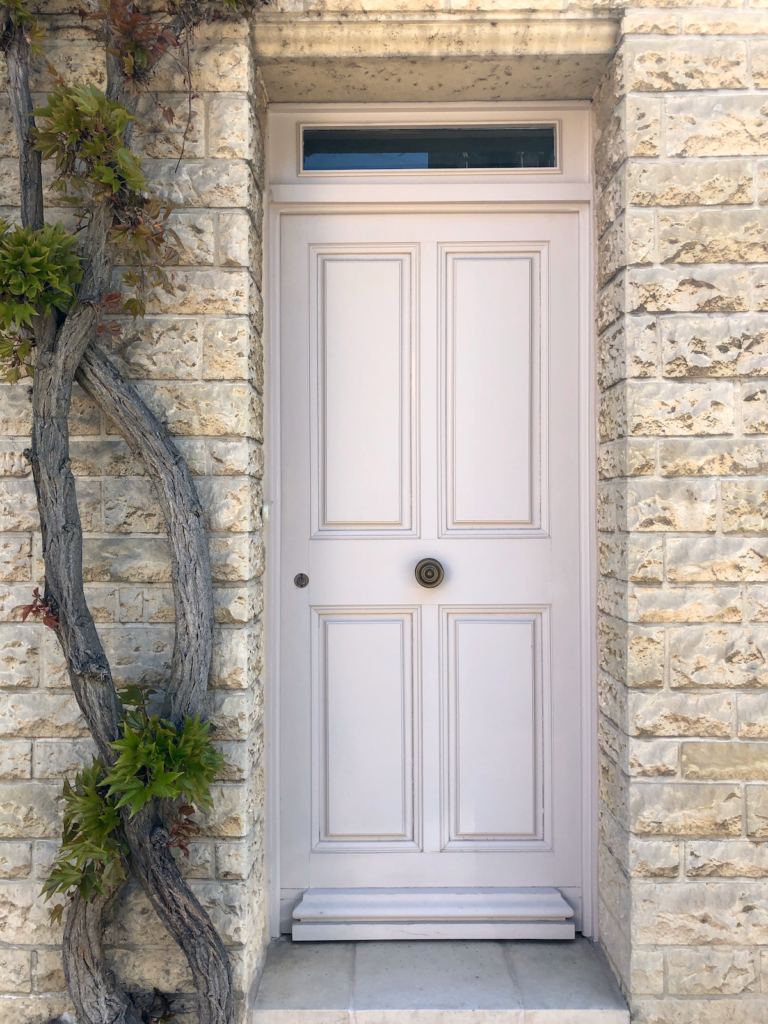
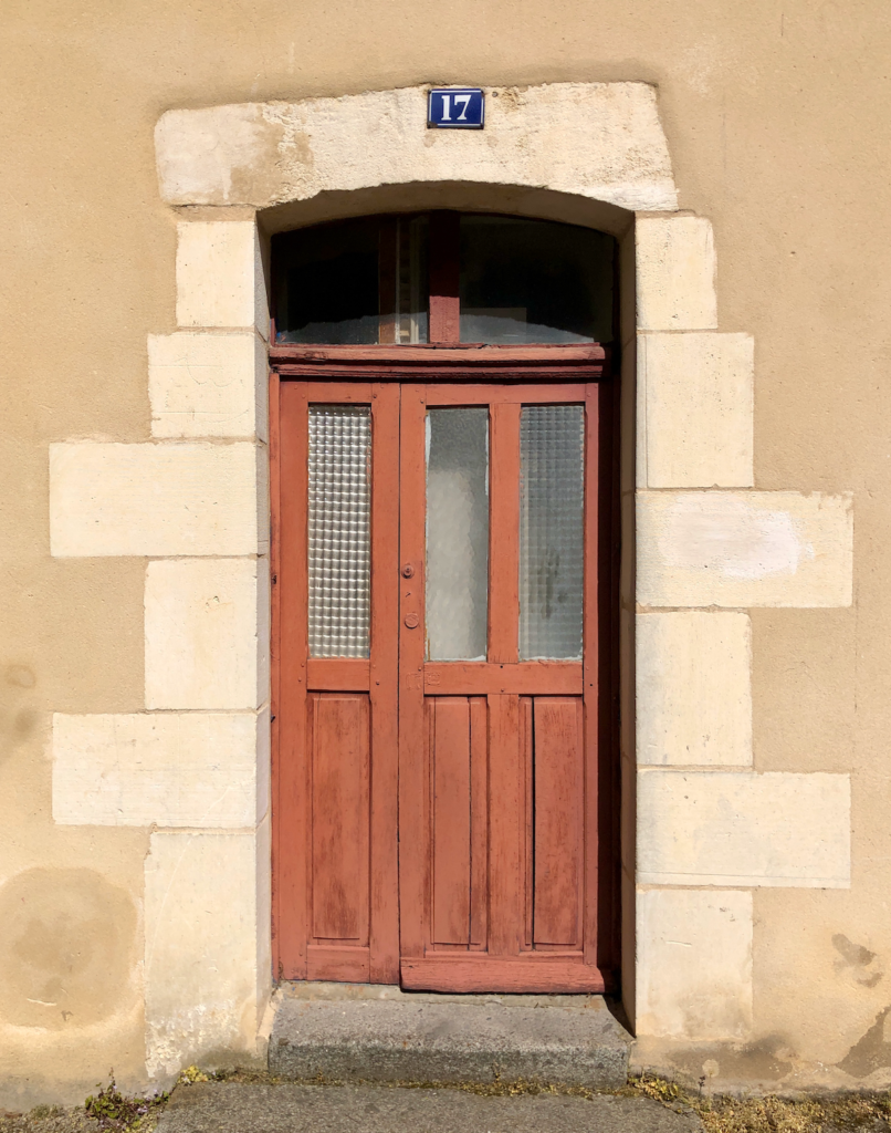
Some of these are examples are more recently painted, but many of them haven’t been painted in ages and are seriously faded — so it’s a little tricky trying to figure out what the actual colors are.
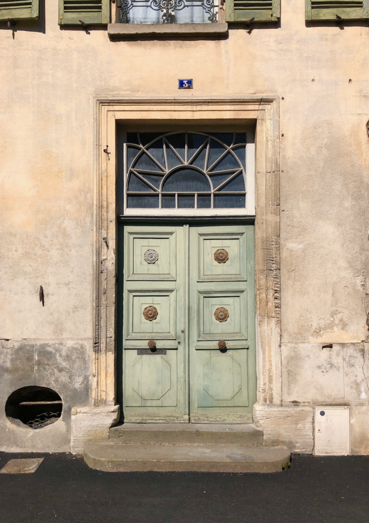
As an example, our entrance doors are currently a dark, matte, teal green:
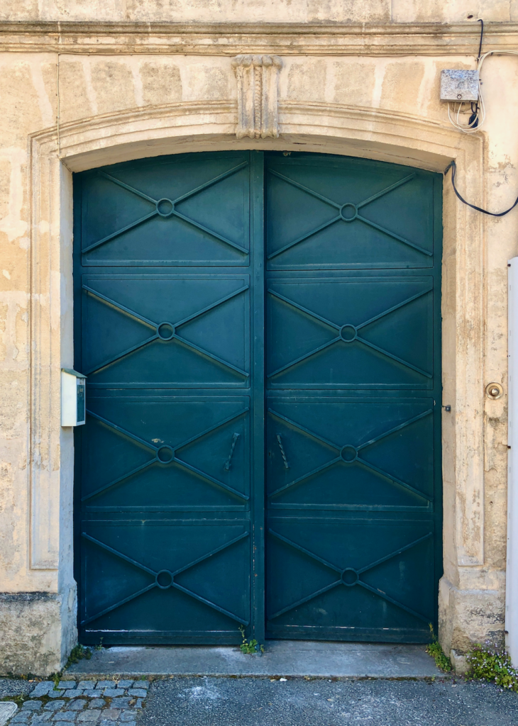
But there’s a strip on the door of the original paint, before it faded, and it’s actually a high-gloss true green. That is such a different feel than the current doors! Makes me so curious about the faded doors in the photos above. What were they originally?
The last thing to mention before we get into color picking, is that the house is in an official historic district, which means we are required to use approved historic colors. I don’t know where to find a list of those colors, and I’m figuring that out, but I’m not bothered about the restriction, because we want to use historic colors. (Also, we’ve heard the rule is not actually very strict? We can’t tell.) So while I’m figuring out what the official historic colors are, I’m just going to choose a color, and then figure out which approved color is closest to my pick.
In the U.S., Sherwin-Williams was my go-to paint supplier but I can’t get their paint or paint chips here, so I’m trying the brand Farrow & Ball for color picking — they’re a UK company but available in both the U.S. and France, so that works nicely for us. They have a limited color range but the colors are particularly special. Here are four I’m currently considering for the exterior — Stiffkey Blue is my favorite at the moment:
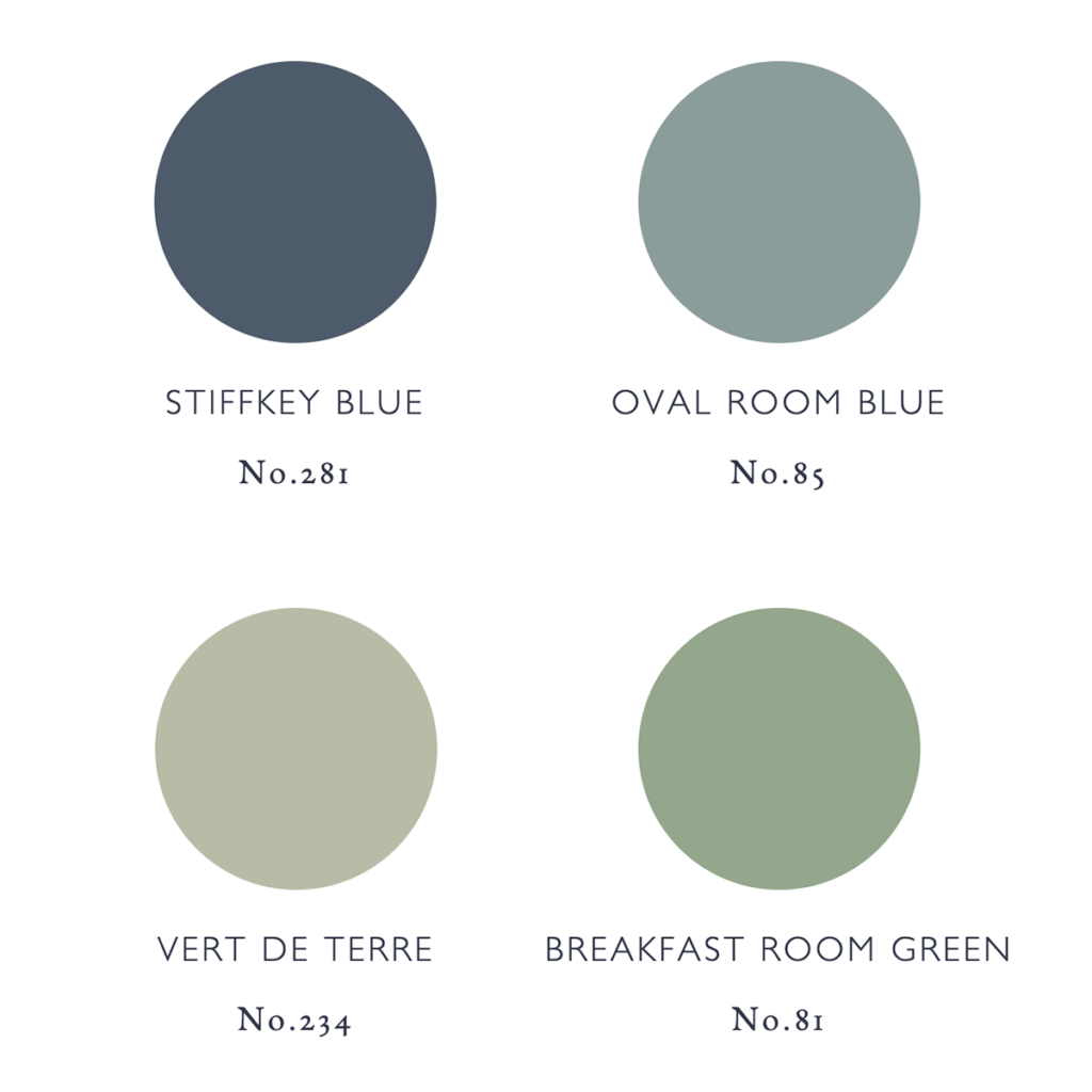
I’m planning to choose one color and use it on all the painted elements of the exterior — the windows, the doors, and the shutters — I want something that really complements the stone face, and will make a really handsome statement when finished. I know it’s really just an accent color, but when I picture the big doors, and the shutters closed, it will still be a lot of color, so I want to make sure we love it.
Do you have an opinion? Would you want to switch up the color options for each element — the door in one color, the shutters in another, the windows in a third? Have you ever chosen a really distinctive color for your front door? Like a bright yellow or a royal blue? In New York, we painted our front door a lime green and I loved it so much. Have you ever chosen Farrow & Ball colors? Can you believe how many pretty doors there are in our little town?
Wow, I would be stuck with this choice! I love the way the shutters and windows sort of blend into the surrounding stone right now, but I LOVE the look of having all the elements a contrasting color too. Good luck with this one.
Mostly I came to say THANK YOU for your posts. When I see you have a new post to share, I get a little leap of joy. Things are kind of dark here in NYC and it’s such pleasure to escape to your world for just a minute.
Also…(and all things considered, this might sound a little silly) I am loving what your hair is doing right now…the dark root with the light ends is so cute. The other day when you posted a story on IG about the puzzle, your hair was a little wild, and I just loved it. Just wanted to let you know that.
So funny, I’ve been thinking the same – your hair is just awesome right now, Gabby! I don’t know why, but it’s excellent :D
Also, I love the blue, green, and aqua colors you’re considering, in that order. If it were me, I *might* go with white pain on the actual windows, and then whatever color you choose for the door and shutters. I just like the brightness of while on window trim.
I agree about the hair! Gabby made a comment about needing to get it done (me too!!!), but I just love it a little wild!
I LOVE your current door color. Omg gorgeous. (Also my fave color). Unless the paint is in poor condition, I’d leave as is an paint the shutters a complementary color.
My front door is brick red.
I like all the colors you posted, chips and photos. For the effect you want, I like stiffkey blue the best. My personal choice of your four might be oval room blue. That’s about the color of my dining room. But really, I’d go with a red like one of the photos. Your stones are on the warm side of neutral to my eyes.
I would go with the green. But green is my favorite color so partial to it. The green door you shared spoke to me.
The stiffkey blue is my favorite! Love the dark blue contrasted with the stone! I’d pint everything the same color too. Can’t wait to see it when it’s all done!
I am obsessed with Farrow & Ball paint. It’s now the only paint I use for any project where the painted surface will get heavy wear and tear. I painted my dining room stiffkey blue and it is the perfect deep blue on an interior, but just as a note I also used it on some exterior stairs and it ended up looking much lighter, more like a medium dusty gray-blue. I have also used Railings (a deep charcoal that looks black in some light, deep navy in others) and Inchyra Blue (looks like deep blueish-green in a closet with no natural light). The quality of the paint is unbeatable!!!!!!
I prefer the cream/hint of mauve color in one of your photos or something in the this direction (something that blends with your aged stone). I prefer this for the windows and shutters. For the door, would it be possible and affordable to strip it back to wood? Else, with a masonry color for the windows and shutters, think you would have flexibility to do really any color with the door. Personally, I would like the same masonry color on the door as well if stained wood is not an option. I live in an old row house in a Swiss town and went through this exact decision process. I think a light color in the same tone as the masonry (especially for windows and shutters) is never a mistake and is a really clean, modern look.
I agree wholeheartedly! I think that it could be a really clean, modern look on an otherwise wonderfully patinaed house!
The dark blue door really jumped out at me from the first. I love the contrast with the lovely old stonework.
For what it’s worth, Farrow & Ball’s “Pigeon” is a gorgeous color, is very French, and would be lovely with the stone facade.
I thought of the exact same color as I was reading! Pigeon would be very appropriate for the door with that lovely masonry. And in the States right now, black steel windows are coming back strong. I could see Pigeon looking lovely with a deep deep navy or charcoal for the windows.
Oval room blue. Doors, windows, shutters. ❤️❤️❤️
Oh, I could look at photos of those historic doors all day long! They’re so lovely! I find that I take so many “door” photos when we’re traveling. All the colors seem appropriate, but I worry that the lightest green, the Verde, would be too close in tone with the stone, and not provide too much of an accent.
I ONLY use Farrow and Ball. They have the best color palette.
I’d keep everything one color, but you can’t go wrong with any of your selections!
Farrow and Ball’s paint is absolutely foolproof, and their full gloss sheen is so stylish. The way the full-spectrum pigments reflect light and change throughout the day is absolute magic. I’ll second Anna’s appreciation of Inchyra Blue, also–almost black in the shade and a serene yet invigorating blue-green in the sun. But it looks like that might not be an enormous change from your current front door? Of the ones you picked, I would personally gravitate toward the breakfast room green. I always like the contrast of greens and blues with stone to bring natural color palettes into human-built landscapes.
Can you refresh my memory on how old your house is? Do you know history of families that have lived their previously? I would love to have someone work on our old windows. They are only from 1915!
The arched windows in your house are beautiful. In addition to wood floors, it’s one of the things I love about old homes. I really love the Stiffkey Blue. It will look very much like the 2nd example under the light green photo. It’s elegant, saturated and cheerful at the same time. My second choice is the Oval Room Blue which I also think is gorgeous
The four colors are beautiful.
What about your neighbors’ colors? I would put a lot of weight on choosing a color that would add to the street or block of houses–to make a nice complementary contribution.
I agree with this. Your house colours will be adding to and effect the streetscape. So what you choose should arise out of the larger picture.
The Stiffkey Blue is definitely my favorite of the 4 you listed. Breakfast Room Green is a distant second. It would be a bit washed out if you choose the light colors. It looks like there is light colored iron work in front of the windows. Will this stay light? It would be a nice contrast to a dark window color. Many of the dark blues and greens could be good. Did you consider Hague Blue, Studio Green, or Inchyra Blue? (Also Farrow & Ball)
Love Farrow and Ball. Stiffkey Blue looks great – they also have a really interesting colour, Railings, that may be worth checking out!
Indeed, in France, depending on the location of his house, you must respect a specification. You must contact the town planning department (service urbanisme) and you will have a sample of the possible colors. The architects of the buildings of France (Bâtiments de France) must make respect the charter.
If you don’t respect or if a neighbor disapproves of the color and goes to the town hall to complain, you must repaint everything.
I was going to make the same comment. I can see the church spire from your window so you are definitely in the 500 m range of an historical monument, meaning Bâtiments de France must approve your paint color. Don’t paint without getting color approval because they are very strict! With all those offices closed you won’t be able to get an answer for months so best bet is to stick to the color you currently have. We live within the zone in a suburb of paris and have had huge problems. I have a friend who had to repaint because it wasn’t the EXACT RAL référence color, similar but not exactly the same. In any case, if you want to change, at the very least take a few options to the city hall bureau d’urbanisme and have them choose.
Little Greene is *much* better than F&B – colour and wear
Oval Room blue is my favorite, only because it appears that your doors are shaded and that would darken the color some and give you a feel similar to Stiffkey blue. Stiffkey is my 2nd favorite, but again, since it looks fairly shaded, it would appear very dark.
Actually love the green shade as well and a creamy white (not one of the fb colors you shared) like you showed in one of the door pics is also so peaceful and soft looking.
Can’t wait to see what you choose – your whole reno is just dreamy!!
I agree that the Oval Room Blue will be beautiful on the front door. The shutter’s would look great in that color also or the shutter’s in a creamy white.
We had our front door painted in St Giles Blue, which we picked from the tile in our entryway so it felt right for the house. I still love it! That may be why the door to no 6 (pictures 5 and 6) makes me smile. I also find that washed lilac grey in picture nimber eight super elegant, not me but it looks lovely and french. I like all your choices! And I think if you go for something restrained and classy like that it would be best to paint everything the same colour.
My hands down favorite from your photos is the last one and then I read the text and saw it’s your door/your current color! Gorgeous. If you want a change though, then I also like Stiffkey Blue. I’m enjoying living in France vicariously via you and your family. :)
I love the green grey of your stone, it’s very clean colored stone. I would make sure the color you decide on isn’t too dirty by comparison. What a wonderful place to live, I’m excited for you all!
I was hoping for a dark, dark, Charleston green. These four all look too pale to me. But I will love whatever you choose, because I never have any fault to find with your design choices!
Thank you so much for these renovation posts. It makes a really positive and fun read, since so much of the news is anything but that. I love your present door colour, but all your choices are nice. I painted the non-stucco parts of our house in a “Mondrian” inspired colour-blocking -probably not to many people’s tastes, but it sure makes ME smile. Also, go ahead and dead-head the hydrangea now. It is a perfect time, as you can avoid bothering the new buds (which are not always obvious in the fall/winter). Just cut back the ends-avoiding the new growth.
I love the deep dark blue with the stone-like the 2nd photo. Would you paint the window mullions the same color? I also notice some very pretty ironwork(?) railings on the upper windows. Those would be gorgeous and more noticeable in a dark finish.
I’m with you on the lovely blue.
Gabrielle,
Do you know Khalil Gibran’s beautiful poem: “Your children are not your children”?
Well, in France, they could say “Your house it’s not your house” because even if you own a house, you CANNOT do whatever you want with it. As far as I know, you cannot switch up the color options for each element — the door in one color, the shutters in another, the windows in a third. The exterior of a french house in almost every town in France is previously defined by some laws and you should check them at the city hall. The laws are very specific to maintain a harmony. The same way, you cannot choose whichever color pleases you to paint the exterior walls of the house. Otherwise, the City Hall can oblige you to undo what you have done. Good luck!
Of the four colors you posted, I like the Stiffkey Blue the best, but, as others have mentioned, your dark dark blue door really stands out beautifully to me so I’d really be tempted to stick go even darker than the four colors you have so far.
Your project is so exciting and just what’s needed to follow along with in these strange times. Farrow and Ball paints are highly thought of in the UK and excellent quality due to the high volume of pigments. It may be of interest to know that Stiffkey is a coastal village in Norfolk and there is some debate about this but I think locals pronounce it “Stewkey”. Any Norfolk locals able to confirm?
Stiffkey is my top choice. With the aged and varying tone/texture of the stone though, I might choose a rich cream white. Something clean and kind of sharp to contrast the natural aging of the stone?
I agree that all elements should be the same colour. I like oval room blue best. But also love the current teal
We painted our front door Vert De Terre and I love it. It’s a bit more green in real life – similar to the faded green door in the picture you posted but a bit less minty. I think it would look gorgeous on your house but would definitely provide less contrast than your other choices. That’s not necessarily a bad thing though!
I am another vote for the Stifkey Blue. I think the contrast looks fantastic and a great blend of traditional and contemporary. It seems so inviting. It will also make it obvious that the house has been given some love and could hint at what is inside.
I wonder if you’re thinking of having the exterior of the house cleaned? If you are it will brighten the stone and I think will look lovely with a pale lavender blue. . That always feels so authentic to me.
Very french and looks lovely with some geraniums in window boxes . I’ve lived in France myself (further south in the Aveyron) and pale colours on the shutters and old windows look beautiful.
Of the colours you posted I would go with Vert de Terre.
You have a beautiful house there with some great features, super cool adventure !
Hi Gabrielle,
all the rules for Argentan are available here (number 11.4 concerns colours and the part Teintes des menuiseries concerns windows and doors). If you are in a protected area (and I would venture you might also be in the protection perimetre if the church next to you is a monument), you need to go and see the Service d urbanisme and the ABF (Architecte des batiments de France) who will give you the list of possible colours. But I would say all of the ones you are thinking about should be fine. Normally, the ABF should give you his approval before you start painting but maybe he has preapproved a list of colours that are available at the Service d urbanisme.
Good luck.
Also, it is good that you decided to pick just one colour, because as said in the local PLUi (planning rules), the colour has to be identical for all your exterior wooden elements.
I vote for the blue – love to Stiffkey shade and the darker blue ( I believe picture 3 on your IG post). I love watching your house transformation/renovation – thank you so much for sharing with us.
A smooth sage green In spanish the color is called verde salvia. My patents painted their door and windows in that color, and is lovely pale. For Sherwin Williams is called artichoe sw 1163 and a paler one is quiet veranda sw1164. Bonne suite
I love the stiffkey blue you are leaning towards. It has a real richness to it and feels strong.
Breakfast room green and oval room blue!
Look for Mylands Colors. They Englands oldest Color Brand but not as famous as F&B. Quality is georgeous, price is lower than F&B.
Thanks for the tip! I haven’t heard of Mylands Colors. I wonder if they’re available in France? I’ll go look them up.
Our front door is Stiffkey Blue!! I absolutely adore it. Our shutter color is also from Farrow and Ball….Railings. They look wonderful together on our old brick and stone home. Looking forward to seeing what you choose. I have loved “living in France” vicariously through you!